 |
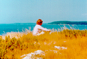
| Artist doing research at Shackford Head |
Painting
on Line –
Log
of the Current Painting by Nannette Michaud MacNaughton
|
| Artist doing research at Shackford Head |
I have always kept a log of each work I produce so that I can recall particular effects which I may wish to use again. When we first developed our web site in 1997, it was my intention to share this diary with our readers. Initially I used a camera to take photos of a works progress but found that the time lag between taking the photo and developing it was too long and I was unable to use the camera for anything else while painting a work. I quickly realized that what I would need (when I could afford it) was a digital camera. Last month I purchased a digital camera which has made it possible for me to finally work on this, and I hope that you drop in often to see how I am doing.
Along with viewing the progress the reader will learn about the business of being an artist. Many artists shy from discussing business, some dismiss it out of hand but I decided that in order to allow myself the luxury of pursuing what I love to do I had to make enough money so that I did not have to take on other work to support myself. The need to support oneself adds significantly to the incentive to finish what you start and to produce more art as opposed to simply dabbling in art. If you have visited this site before hoping to view new material, bear with me as I learn how to put this all together. Below I begin the log with my current work titled "Inside Out".
Before
I introduce you to my current painting I’d like to tell you about how I approach a
new work, some basics about supplies, materials and the preparation process.
Because I live in an exceptionally beautiful place finding subject matter to paint is not a problem. In fact during my daily walk I experience a sensory overload and obsess about rushing back to my studio to paint what I have seen. Generally there is one particular view of every scene, which catches my eye. For instance I can pass a house day after day without seeing anything extraordinary when suddenly the light will hit the building in such a way that I see how lovely it is. Or spring will reveal a brilliance of color of newly opened tulips in the corner of a shingled shed in tones of silvery gray. I try to capture what I see, not my interpretation of the scene, but rather what is actually there. I sometimes deviate from this literal depiction by eliminating or adding something that isn't there, but only if I feel that by doing so the final work will be more effective. One painting that I did became more dramatic with the addition of a tree, which was actually located at another spot. I simply "transplanted" it.
The tools of the artists trade are varied and you should not hesitate to rely on them while learning the craft. As a self-taught artist, I have employed whatever tools are at my disposal in order to obtain the results I am after. Eight years ago a retired graphic artist let me borrow a projector to enlarge the image and project it onto my canvas. I also enlarged photo’s to work from. In both cases the enlarged image was not well defined but it gave a good enough outline for me to measure from and to block in the shapes in pencil onto the prepared canvas. I only did this if the work was a building or an object such as a boat, which involved perspective rendering. The basic sketch gotten from the projected image must be further developed. The projector cannot take the place of the careful measuring needed to define vanishing points and the detail required to produce a good perspective drawing. In the last few years I no longer need the crutch of the enlarged photo or the projector. These tools are frowned upon but for the artist who cannot afford to attend an art institute I say do what you must to learn to paint. As you become more proficient at painting you will automatically find yourself buying books about lighting, color, and perspective. Read and experiment and you should be able to pick up a classical education. When you have the opportunity to seek out professional advice, don’t be shy about asking for that help. Most professionals are enthusiastic about the subject and are willing to share their knowledge. This has been my method of learning and it has developed my confidence and helped me to meet new challenges.
I have employed the use of drafting tools to render my preliminary sketches. I find the tools especially helpful if I am painting objects like buildings or boats. I use a drafting machine but a straight edge would be just as effective. I use large triangles, a scale rule to help me measure and sometimes a 109 ships curve. All of these items can be found for sale on our order page for the Yacht Design School and later I will be adding them to my order form..
| By mixing each new tube of paint you buy with another in your paint inventory you can produce many colors to choose from. | |
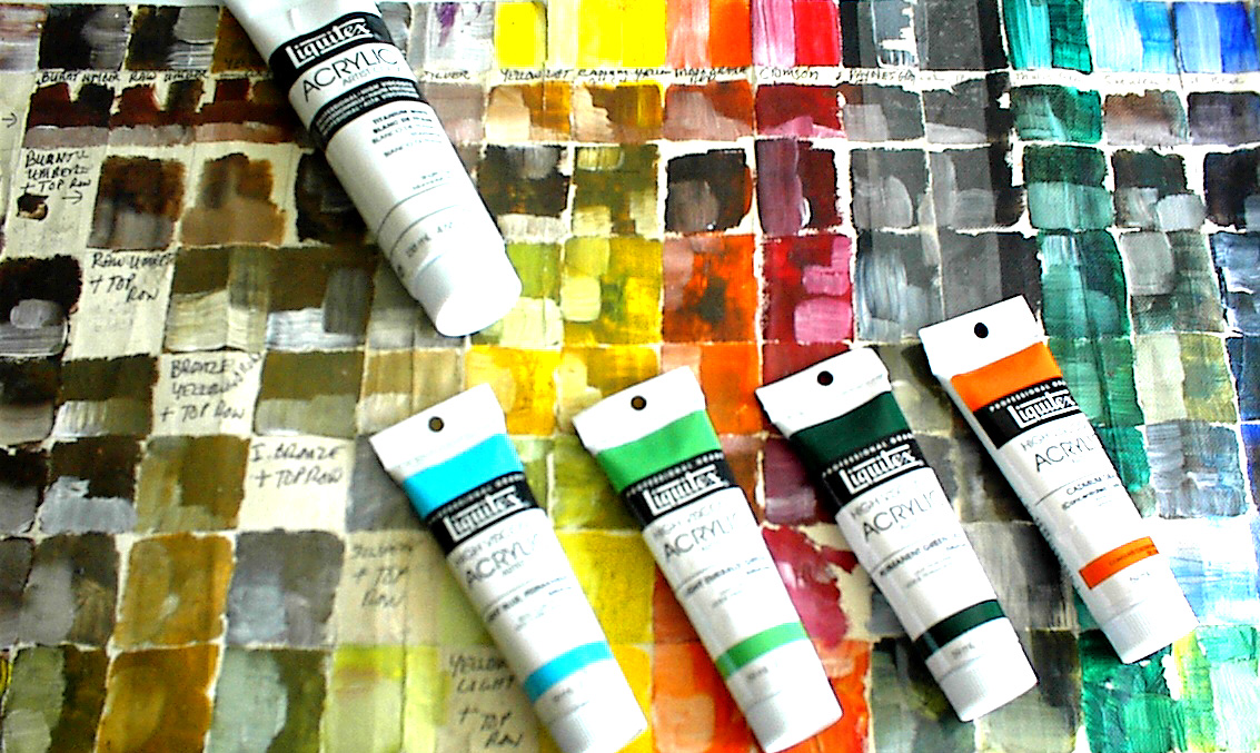 |
Choosing the colors I want to use in a painting has been simplified by the use of my custom-made color chart. Above is a section of my chart. In the top row I record each new color I purchase and beside it I mix white. The rows, which follow, are for new tubes of color, which I mix individually with every tube in my inventory, and beside it I mix in white. I go to the scene with my color chart and record the colors I want to use. With the range of colors from approximately 40 tubes of paint I quickly find the right colors for the painting. The color chart saves me paint because I’m not wasting it by randomly mixing and this saves time as well. I recently came across a wonderful little book that I will use to replace my chart. Using 34 tubes of paint you can get 2000 colors. This is complete and compact so that I can carry it to my painting site and note the colors I want to use in my work.
I am a studio artist for a number of reasons. Many artist like to set up right on the spot to paint but I am bit of a hermit and do not like to be observed while painting. The environment does not always cooperate. The sun might be too bright so that I am constantly squinting and because I use acrylic paints which dry quickly the sun tends to dry what I use from the tube very fast even when I use a retarder to slow drying. A brisk wind can easily slow progress on a work by disturbing the canvas or sketchpad, or in the winter the cold makes it impossible to work outdoors. For all these reasons I prefer to work in my studio where I can listen to and be inspired by composers like Beethoven or Tchaikovsky as I paint. Photos cannot provide important details so I do go back to the spot for color and sketch notations and to kept in touch with the mood of the work.
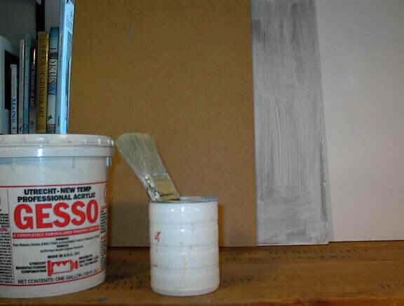
Above from left to right is the raw Masonite board, the board with one layer of gesso, and the finished gesso board (it generally takes between 3 to 4 coats both sides).
____________________________________________________________________________________________________________
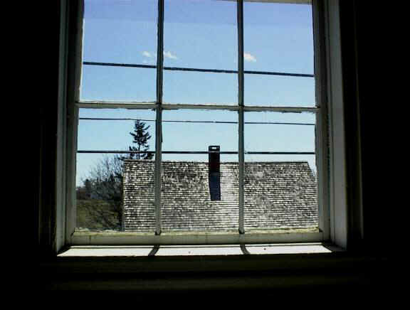
"INSIDE OUT" is the title of my new work. Above is a photo of the scene which I have begun painting. This view is from a house in Eastport owned by our friends Rebecca and John. The midday sun was doing wonderful things here and although the house is empty and not yet occupied I imagined myself sitting before this window in an easy chair with the sun, a good book and a cup of hot tea to warm me. I’d drift back and forth between the book and the scene lost in both worlds. I hope I can “get it” right.
My first step in starting a work is to do a preliminary sketch. Sometimes I work on tracing paper and sometimes I work directly on the board. With this painting I decided to work on the board so the first thing I did was to define the lines of the window using my 0.3 mm drafting pencil. This well-defined drawing helps me to freely paint in the shadows and light.
Before lying in the sky I used magic mending tape to preserve the sketched in window lines. Using a variation of a method described by John Stobart, a marine artist I admire, I blended light blues in the upper sky and subtle white gray in the lower sky. Using my large gesso brush I laid down globs of the colors employed in the sky blending them while they were tacky. If I blend while the paint is too fresh, I will loose the two separate colors I am after and they will become just one color. The upper sky and the lower sky are two different colors but I am after a blending of the two somewhere in the middle. If you study the sky, you will see this actually happens. The most maddening time to attempt working a sky is at the peaks of the sunrise or sunsets. The color change is so rapid and so fantastic it seems impossible to capture it. The color chart is especially helpful here as you can make quick notes about what you want. Painting this is a delicate balance and fairly subtle so you need to muddle through until you get it. Every time I do this I come up against all the same problems over again and I just keep at it until it is the way I want it. I can say that this is pretty much true of most aspects of my painting.
As I write this, I realize that it sounds like this whole process took only about fifteen minutes, but as I read over my hand written log, I actually laid down a whole other sky color and type, which I rejected. The sky went from a darker blue with white clouds to another sky type, which I don’t even remember now. It takes time to get the colors and textures just the way I want them. After a while you begin to know at what speed you must work to achieve effects. Most always the interesting effects I discover are done by chance. The longer you paint the more you will develop your own techniques. Perhaps when I am an old lady I’ll be able to wave my brush like a magic wand and effortlessly produce beauty but somehow I don’t think so.
Shot # 1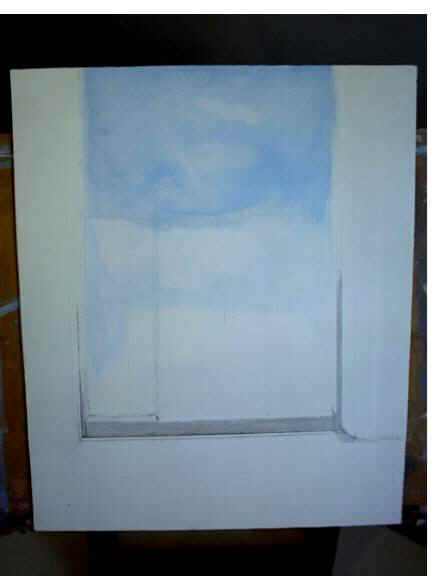
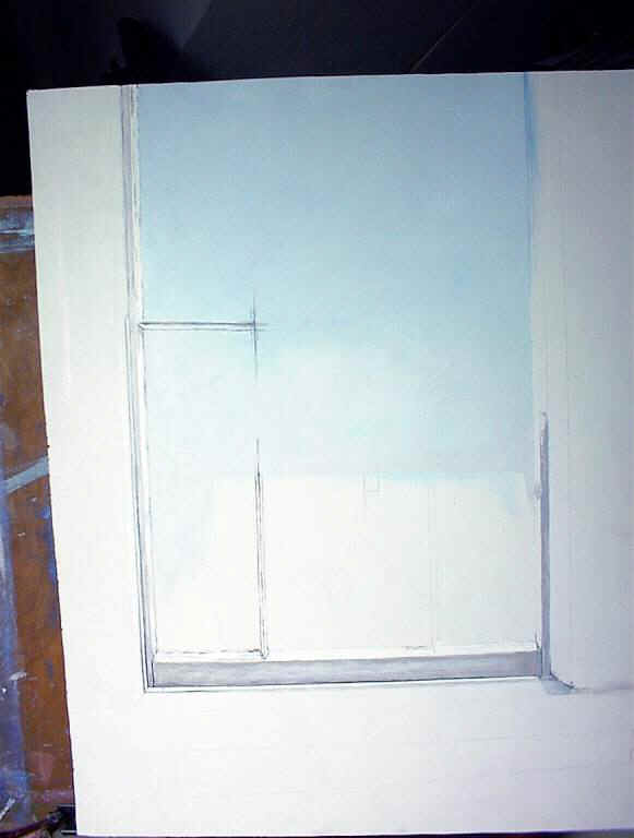
Shot # 2